How to use theme
Styled components
Re:Earth is setup to rely predominantly on Emotion's styled components to style Atom and Molecule components.
Basic usage
From within your component, just above the main component export declaration, you can declare a new styled component like so:
import { styled } from "@reearth/theme";

...
// React component
...

// regular HTML element
const Wrapper = styled.div`
    background: blue;
    display: flex;
`;
// imported React component
const Header = styled(Text)`
    color: white;
`;
// using project defined theme variables and passed props
const Button = styled.button<{active?: boolean}>`
    background: ${({theme, active}) => active ? theme.background.lightBg : theme.background.mediumBg};
`;

export default MyReactComponent;
Global theme
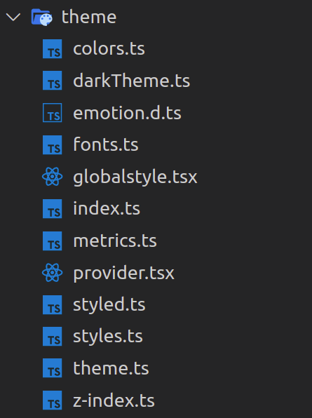
To keep the theme consistent across Re:Earth and up to date with Figma, all theme definitions are abstracted and grouped into global objects inside the theme directory.

We will discuss the purpose of each of these files:
Colors
Re:earth's color system helps you apply color to your UI in a meaningful way.
Building a consistent system of colors helps to reduce the number of used variables, and eliminates unnecessary duplicates, so in Re:Earth all used colors are stored in an object inside the colors.ts file.
Theme
theme.ts has the necessary types to define the colors of components, this type currently is being used by two theme variants dark and light theme, defined in darkTheme.ts and lightTheme.ts.
Each of these theme variants use constants from the colors object to define the color of each component.
Metrics
All metrics details are kept inside mertrics.ts to keep sizing and spacing consistent throughout Re:Earth.
Common uses of Metrics are:
- Height of main UI components
- Padding, margins, and spaces between components
Fonts
All font details (font-family, font-size and font-weight) are kept inside fonts.ts to keep text consistent as well.
There is a Text component which leverages the theme fonts and is used to format all text in Re:Earth.
Note: Never define typographic styles such as font-family, font-size, font-weight, etc in another component. Always use the Text component.
z-index usage
Managing z-index across large apps can be confusing. CSS is hard to test, so to avoid hiding some important UI by mistake, we use the following approach:
There is a file z-index.ts that contains an object which is dedicated to declaring constants with meaningful names for important UI components that need z-index values.
Theme switcher
We are using React’s Context API to maintain the state for the theme of the application (dark/light).
This context is defined inside the provider.tsx file.
Theme usage in components
From within your component, if you need to access theme properties, you can either pass theme into your styled component (as shown in the above example) or use the useTheme hook to get access to all theme properties inline:
import { useTheme } from "@reearth/theme";

const MyReactComponent: React.FC<Props> = ({my, cool, props}) => {
  const theme = useTheme();
  return (
    <Text size="2xs" color={theme.main.text}>
  );
};

export default MyReactComponent;
Icons
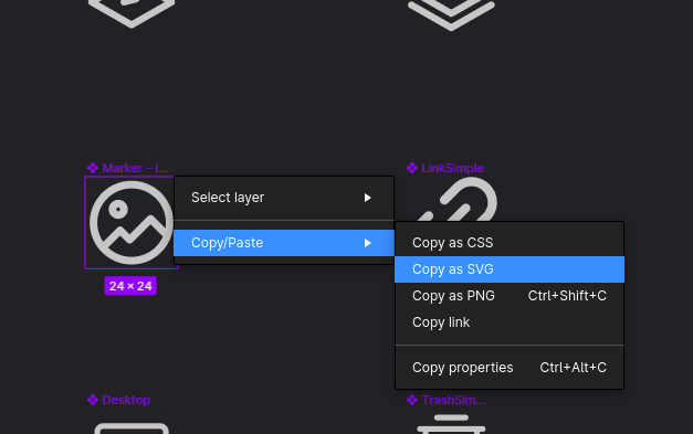
To add a new icon to Re:Earth project, follow the following steps:
- Right click on desired icon from Figma, then choose
copy as SVG

- create a
.svgfile insrc/components/atoms/Icon/Iconswith an appropriate name and paste copied content there. - For most icons (except for logos or icons with complex colors) make sure you change the
fillof all elements inside thesvgfrom the hex color to “currentColor”. (This will allow the icon's color to be changed from within the Icon component.) - Import the icon inside
src/components/atoms/Icon/icons.ts, then add it to the exported object with a simple but meaningful name. - Now you can use the
Iconcomponent like this:
import Icon from "@reearth/components/atoms/Icon";

...
// React component
...

//inside JSX
<Icon icon="cancel" />

...
// React component
...